Becon 2.0 Design System
The project
Redesigning our design system to lean towards ADP’s new marketing rebrand. I was working on ADP’s product, Lifion’s, when this project began. Our initial goal was to update Lifion’s styles and implement these changes. As the project progressed our scope extended for our foundations to serve ADP’s suite of enterprise apps.
My involvement
I was involved in the project in 2 parts. Redesigning the components and Implementing a token architecture.
Current state
When this project began we had multiple design systems and styles at ADP. Our initial focus was tackling updating the styles of the Becon design system at Lifion.
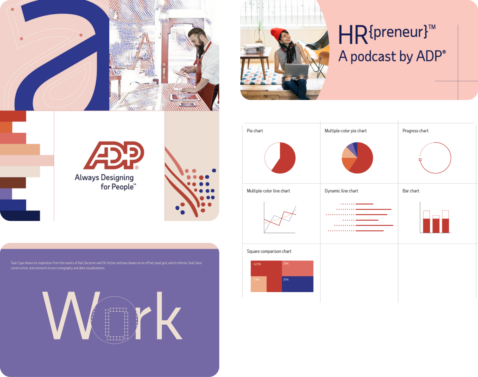
Rebrand
Here's a sample of the marketing rebrand we were aiming to lean towards.
Discovery & Exploration
To start off the project the team and I canvased competitors and peers in the space identifying trends and things that we thought worked and didn’t work. We also did some blue skies explorations trying out different styles and reviewing those as well. This helped us set up certain guard rails to help our project progress faster.
Design & Refine
I took the charge on re-skinning the components of the system. I worked on batches of components at a time, starting small and getting larger as i progressed. Each week i would explore multiple style treatments of each component, reviewing with the team, and making a decision to move forward.
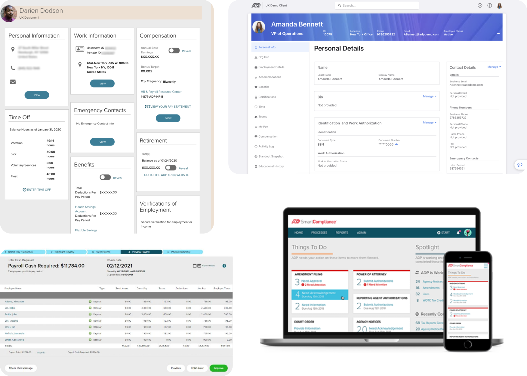
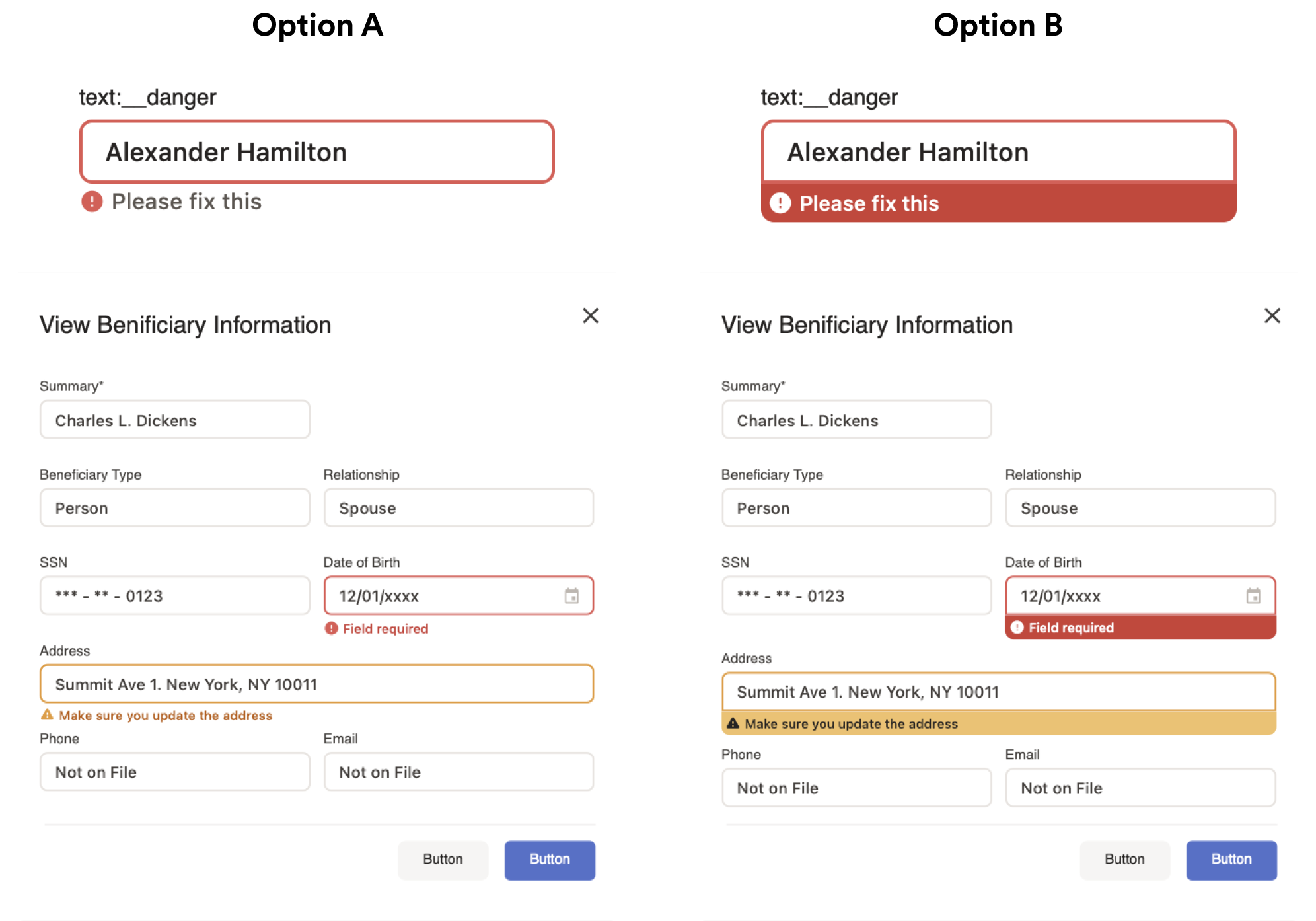
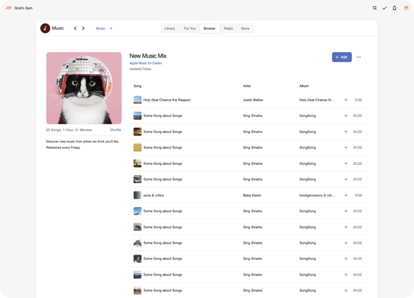
Stress Testing
We stress tested the decisions we were making by sharing out a component tearsheet with designers across ADP. They were to use the components and styles to recreate their products and ultimately come back with feedback to iterate upon. I also personally stress tested by recreating various existing screens from ADP products as well as trying o recreate popular products such as jira and apple music.
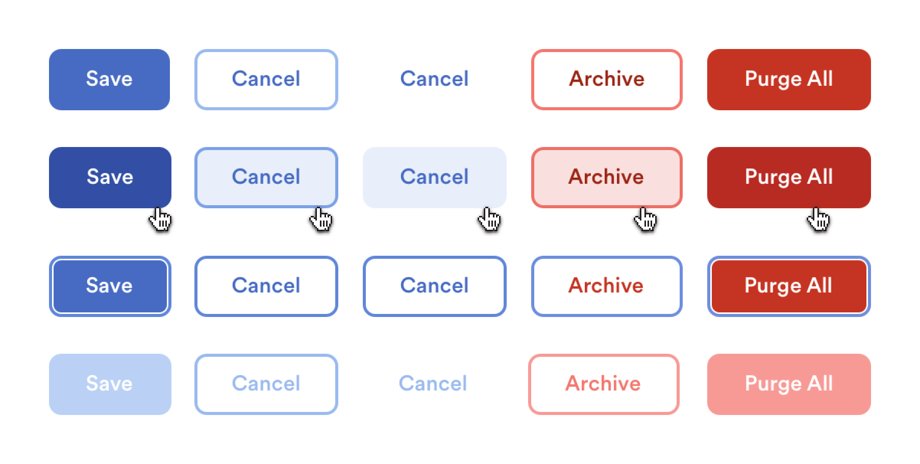
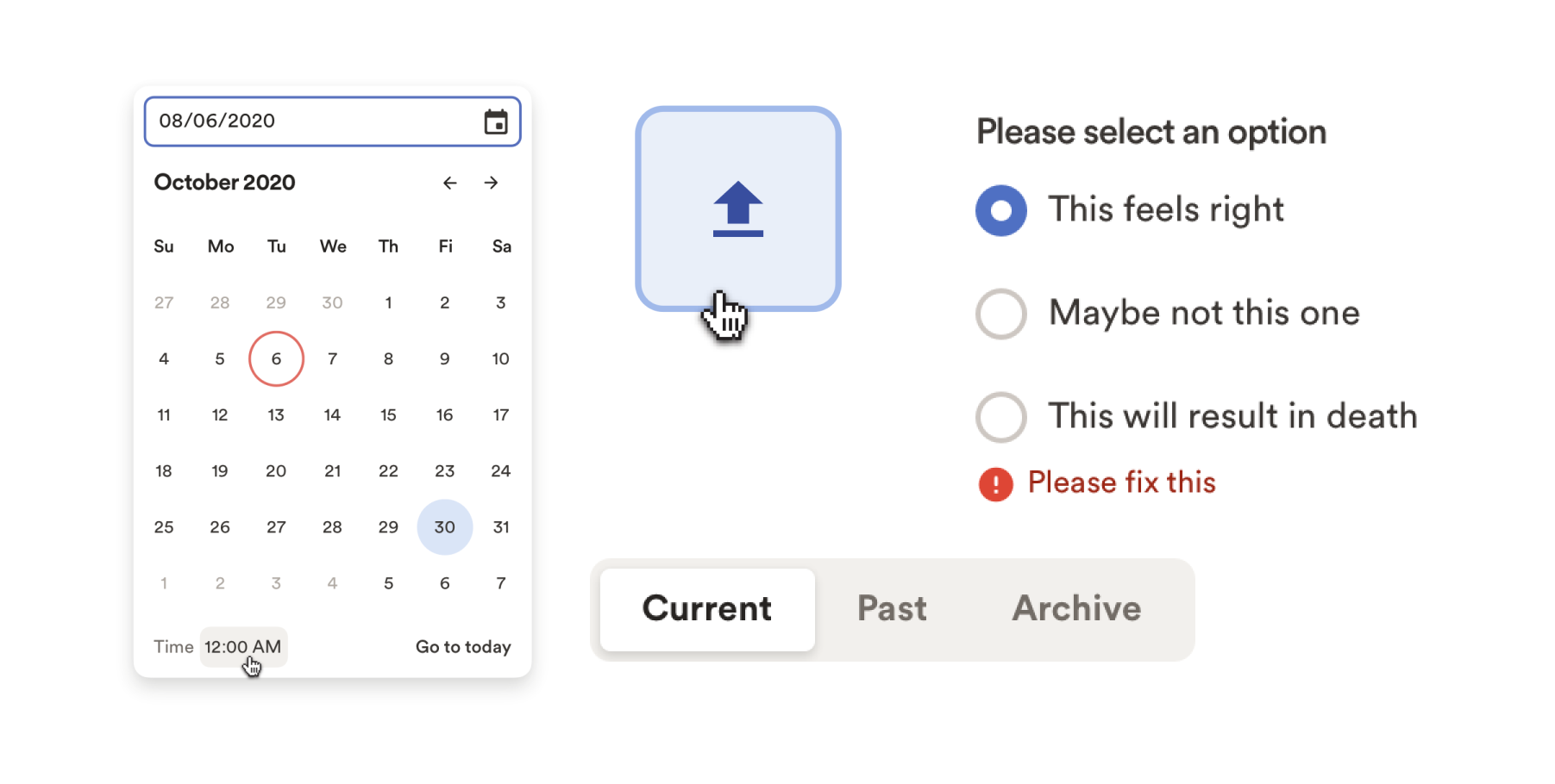
Components
Heres a look at the finalized refreshed components.
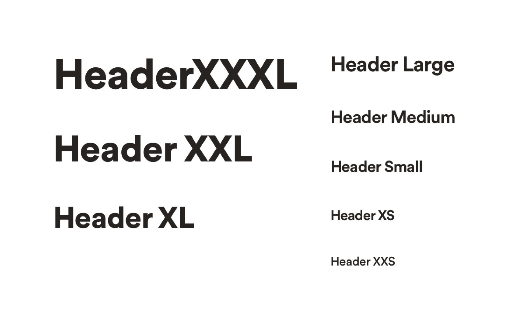
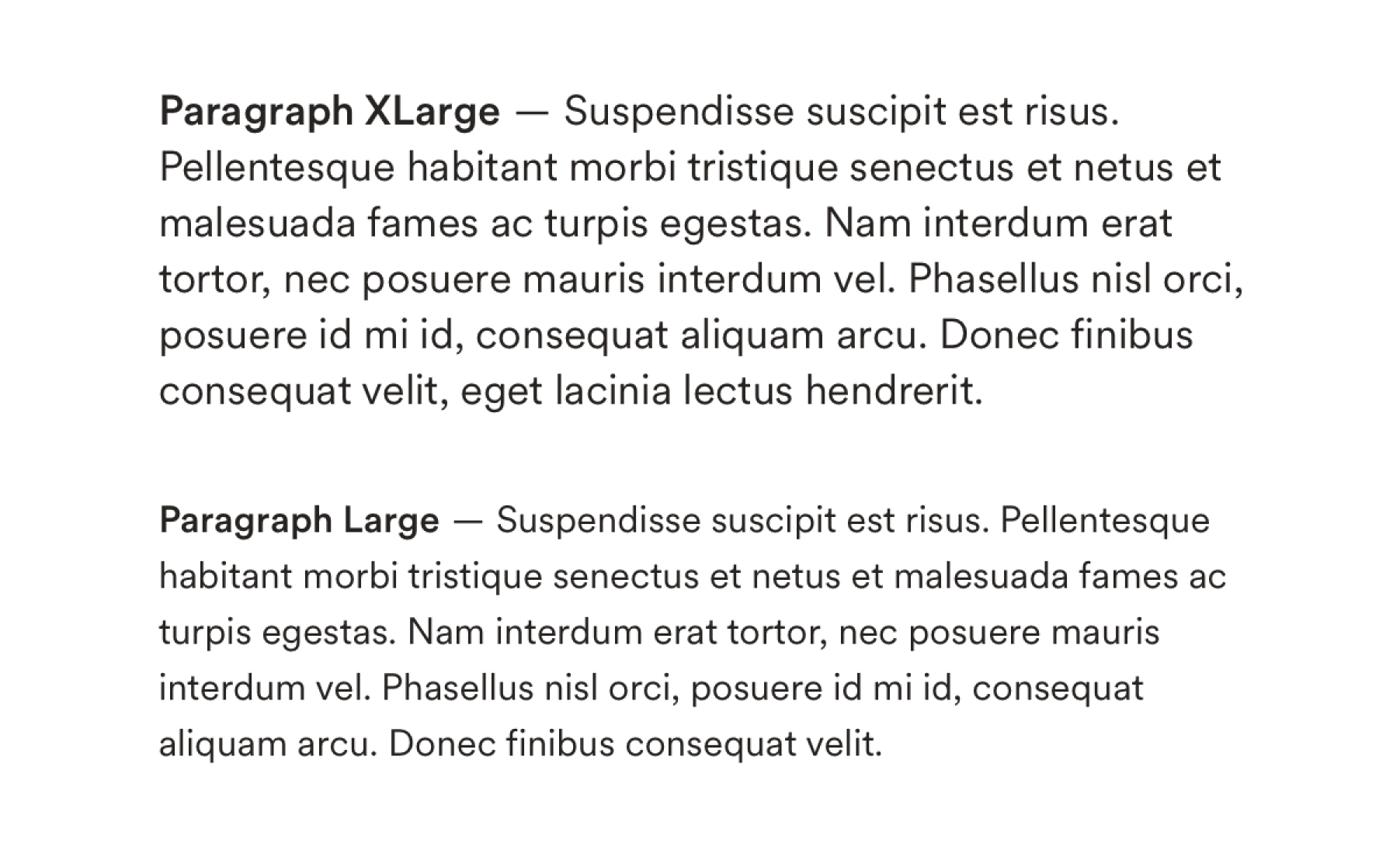
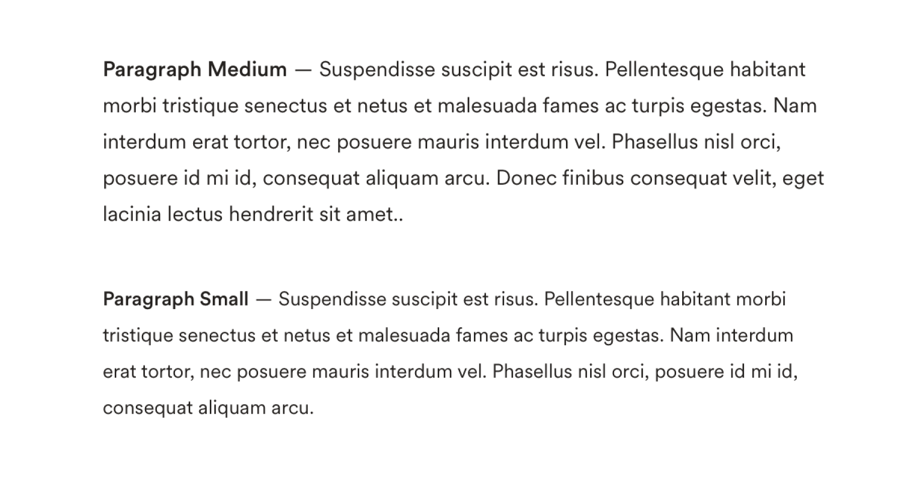
Typography
We landed on a font family and stacking that would support our needs such as monospace characters and localization. My coworker Chad owned the typography system of the refresh. We intended on a minimum font size of 14px for legibility. Included a 12px font size for special cases such as legal copy and condensed components.
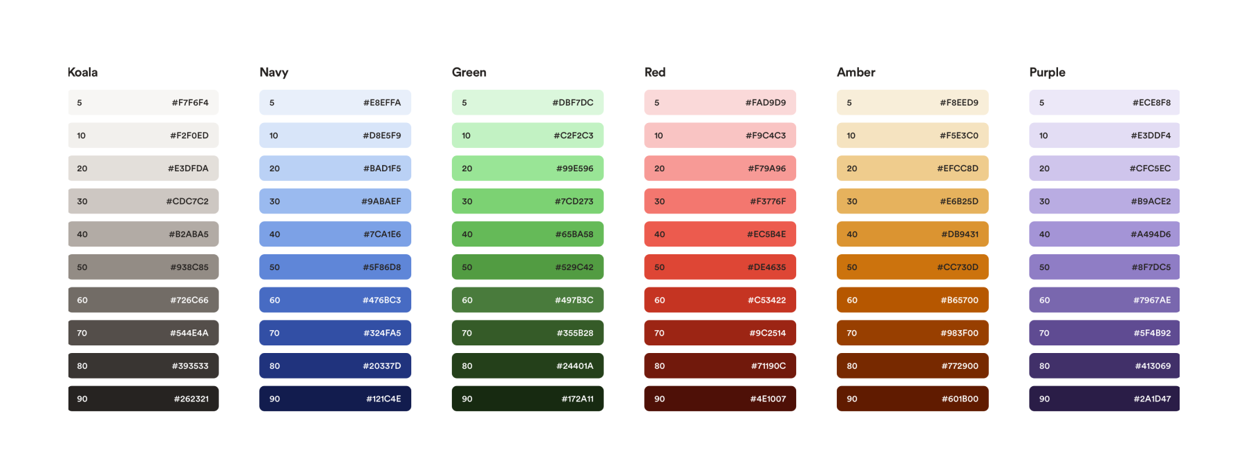
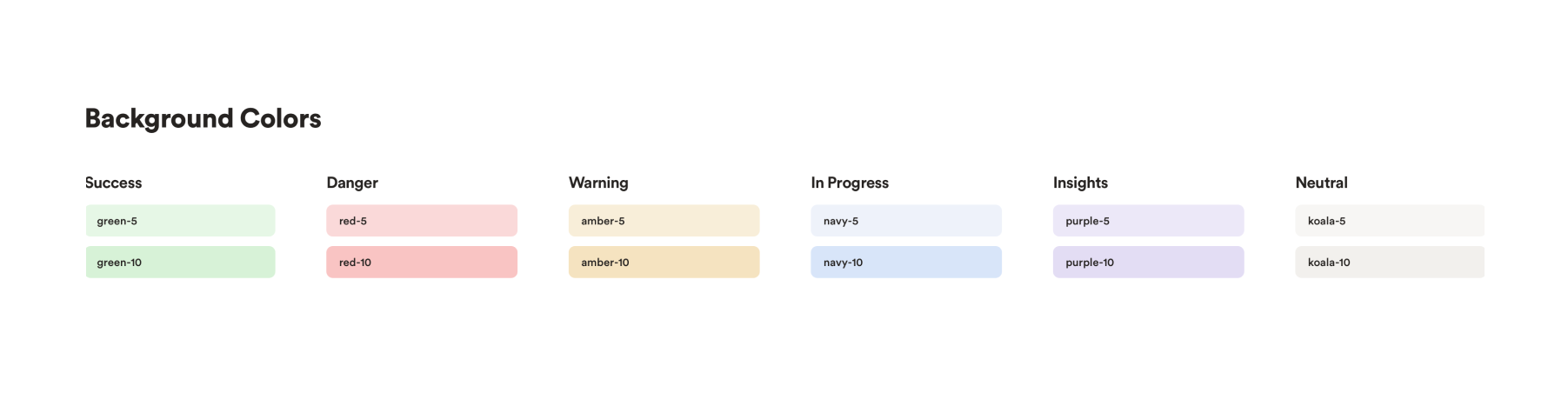
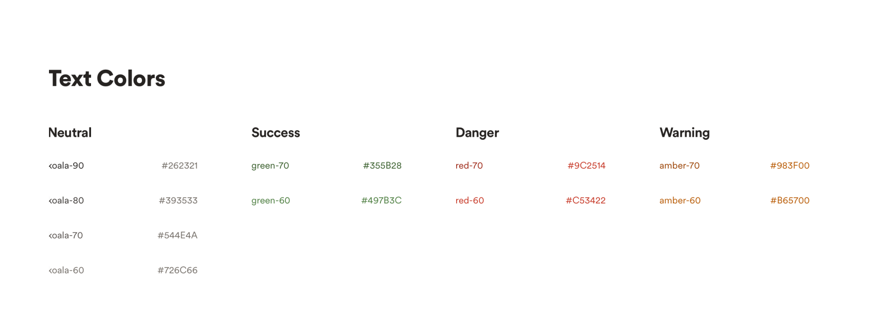
Colors
We created a color system with contrast accessibility in mind. Setting up our parameters to ensure that our font colors passed contrast accessibility on top of all of of background colors.
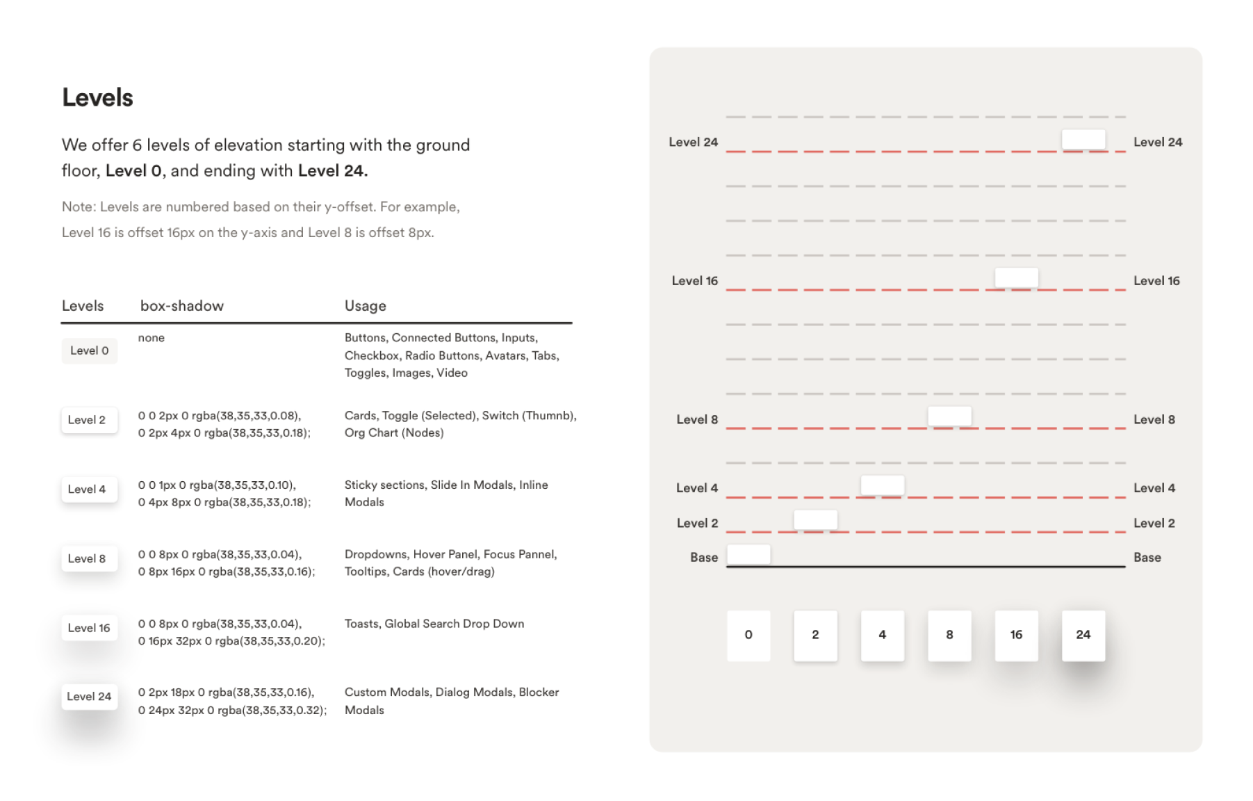
Elevation System
I owned the elevation system as well. Leaning into a soft shadow aesthetic and mapping elements to their appropriate levels.
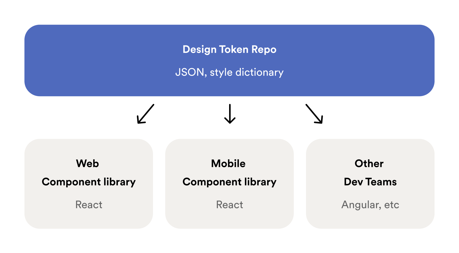
Design Tokens
Once the component refresh was nearing completion I hopped over to help my coworker with the design tokens. For our design tokens we leveraged style dictionary so that we could maintain our values in one place and export them in multiple formats to support the different tech stacks our dev teams used.
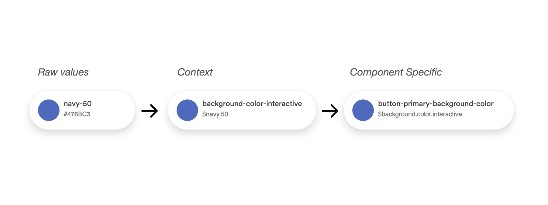
Three tier system
For our design tokens we leveraged a 3 tier system. Base: Raw values, Context: Meaning applied (theme layer), Component: Component specific
Implementing V1
Once our token structure was set up we went into the component repo to replace all hard coded references with the appropriate token. For phase 1 our goal was to have our current V1 styles powered by our new design token repo.
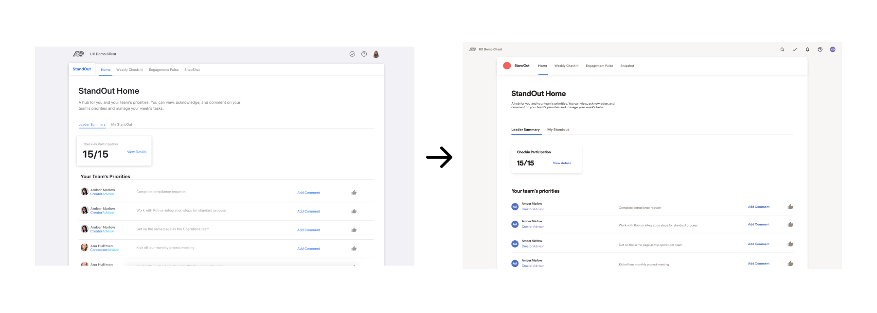
Switch
Once we had our V1 styles being powered by our design token repo and our V2 tokens in a good place we were ready to switch over completely.
Fin
Since working on this project teams across the company have begun to adopt the refresh and are updating their products to have a cohesive look and feel.